This Site's History
Site 1:
Pretty Outside, Ugly Inside.
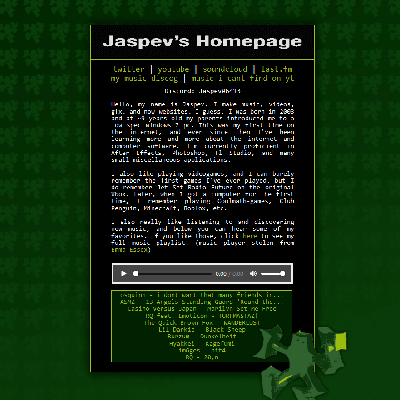
 This was my first website, made some time in late 2022. Even now I still think this website looks quite nice. It’s background would scroll, it had an animated gif with bouncing letters as the banner, the icon in the bottom right would rotate back and forth, and it even had a music player (using javascript that I stole from another site) that would play of some of my favorite music!
The problem with it though, was that it was impossible to update. If I added a single more word to the main body of text, it would scale improperly, then the icon in the bottom right wouldn’t align for some reason, it was a mess behind the scenes. And really the entire website just said who I was but it didn’t really link to any of my work. So I went on to make another website from the ground up!
Site 2:
Ugly Outside, Ugly Inside.
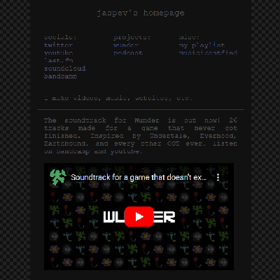
 This was my second website, made some time in early 2023. Probably my worst looking website to this day. It had a limited color palette of 2 tones of gray and 1 color of blue. I simply used this website as an update feed for anything I was doing at the time. The last update I had posted was for the Wunder OST, and I just embedded a YouTube video with a small description of what it was.
This site, behind the scenes, was somewhat manageable, and updateable. I would just replace whatever the current update was. This worked for a while, but eventually I wanted to add more than just one update at a time, and how I made the website didn’t really allow for that. I was still having the issue with things not scaling properly when there was a lot of vertical content.
When you’re making a website, you need to know exactly what you’re going to do with the site before you start. So I started again, using everything I had learned previously, and now having a clear vision of how I wanted my site to look, and how I wanted my site to function.
Site 3:
Pretty Outside, Pretty Inside.
But Still Not Good Enough…
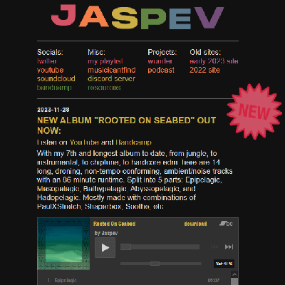
 This was my third and penultimate website, the website that came before the site you’re looking at now. It was made sometime in the second half of 2023. This site had everything I wanted at the time. There were links to my socials and other projects at the top, then it was just an update feed of every new thing I was doing at the time. You could scroll down and see the history of updates, and each update I embedded either a YouTube video or a Bandcamp player where you could play my music directly on my site. The “JASPEV” header was wavy (like this current site) and the “NEW” tag would rotate back and forth, just like how the little icon in the bottom right of the first site would.
I really liked this website, and behind the scenes, it was simple enough to add a new update entry. I would just copy and paste the previous entry, and switch everything around so that the date was correct, the links were correct, etc. But this meant I was still manually editing html and css at this point, and I knew there were easier ways of doing this stuff. Also, around this time, I wanted to do even MORE with my site. I wanted a blog, I wanted giant a resources page, I wanted an about me page, I wanted individual pages for all my projects, etc. I wanted my site to be like all these other sites I see: all custom with a bunch of pages to explore around for an afternoon.
So once more, I went to make another website, the website you’re seeing now. Except I knew I needed to move on from just using raw html and css. With the way I was doing it before, it would be incredibly time consuming and tedious to make the current site you’re seeing. So I needed to learn a completely new way of making websites.
Site 4:
Current Day.
Good Enough, For Now.
I eventually found this blog by Melankorin about how they go about making websites. In this blog, they talk about something called static site generators. This is exactly what I wanted! With a static site generator (at least with the static site generator I use, Hugo) you can make a layout in html of peices of the webpage you want to be consistent with every page. Then the actual content of the page is made in seperate markdown files, not raw html. So there it was, I finally made a site that I think is pretty on the outside, and very pretty on the inside. If you’d like to read more about this site, and how it’s made, I’d recommend this other blog post by me.
Thank you for reading. :)